Sunday 18 December 2022

Publishing Task 3: Final Website Migrated, Plugins and Code Snippet Choices

 Migration

After deleting any previous databases on phpadmin and wordpress files I began working on CA2. When I finished my localhost I proceeded to buy a domain on ifastnet just like I did for CA1 and I named this arteview.site. When I downloaded the All in One WP migration plugin that is where I got the issue I could not resolve for days. This issue was the maximum upload file size as it was as little as 2MB and my file was 198MB.


I tried a plugin that increases this value but it didn't work, the manual that pops up from "How-to-increase maximum upload file size" and YouTube tutorials but nothing worked. I payed for 6 services on Blackknight in the hopes of the size increasing but instead it said "This site can't be reached" and on a different domain from Blackknight it did work but it was also 2MB. I had no choice but to upload this assignment without migration.

Theme

The theme I used was the theme I set a goal on which was Blocksy in my recent publishing task. It was important to me as Blocksy offers a lot and it's simple to edit it. I changed the layout of my Arteview name and the logo beside it by changing the size and placement.

Plugins

My full list of Plugins:

Akismet Anti-SpamAll-in-One WP MigrationCode SnippetsJetpackSmash Balloon Instagram FeedWooCommerceWP-SweepYITH WooCommerce Wishlist

When I downloaded WooCommerce a lot of the plugins the above came with it. They were important as I wanted my site to be a shop and a blog all in one for artists out there.

Code Snippets

I downloaded the Code Snippets plugin as mentioned in the above and I have the following activated: 

Make upload filenames lowercase

Disable admin bar 

Allow smilies

and Current year 


Thursday 24 November 2022

Publishing Task 2 (5%)

(Section A) – What we will build? 

The website genre I aspire to build will be based on art. Users will be able to read these reviews and publish their own comments under them, there will also be image and/ or video-based tutorials for users that would like to learn certain new techniques. The result will have a professional and minimalistic look with a navigation accessible to everybody of any age. The two UX features that I have decided to incorporate into my website are  

  1. 1. Adding a wish list/ favourite’s option for users so that they can organise the content through their own preferences. For example: If the user wants to go to a certain tutorial, they can reach this content in their favourites instead of looking for it. 

2. A simple navigation and format throughout the website down to easy to read typography with the recommended fonts and sizes and overall accessibility.


https://artreview.com/ is a visual the perfect example of a website I would like to create it uses a lot of imagery which is one of my goals


(Section B) – Why build it? 

The website genre that I have chosen will be easy to write about as I am an artist myself and art is very expandable therefore it will have to be upgraded frequently. With this chosen genre I will incorporate images and videos, lessen the number of clicks, the visibility of the website will be minimalistic as I will strive to avoid cognitive overload from my users, I will add plugins that will censor inappropriate comments and protect against spam and lastly a plugin for a favourites/ wish list option as mentioned in the above section. The navigation will consist prominent artistic themes for example: surrealism, abstract etc. and under these themes the content structure of art reviews and tutorials for that specific theme will be held.  


The image above shows the videos I will include for my users under 'tutorials.'


(Section C) - How to Build it? 

I will use the following plugins: 


1. WooCommerce 

2. YITH WooCommerce Wishlist 


After testing which plugin to use for the wish list goal I have found YITH WooCommerce Wishlist is the best one to use. I found that I had to download WooCommerce as the wish list plugin would not work without it.


3. Akismet - the anti-spam plugin

4. For my last plugin my goal is to use Jetpack for security- in order to test this plug in I have to upload my website online.


The theme I want to use is called: Blocksy.

After completing further indepth research about Wordpress- Ferdy Korpershoek said that this theme is the best free theme for Wordpress currently in the market.

https://youtu.be/KWuc4vITAVY 

It provides you with more functionalities than any other theme.


(Section D) - Interacting 

I enjoyed Karen's blog post for this publishing task and she is considering to do similar UX features like me for example she will also make it accessible for any person to read and uphold their attention span as she has stated that posts can stretch their word count to as far as 1000 words. A block of writing that big will discourage users from staying on your site.


Karen's blog: https://cmskarenmachie.blogspot.com/2022/11/ux-goals-publishing-task-2.html?sc=1669318614839#c1747934920155569843


Thursday 27 October 2022

User Experience (UX) Explained for Best Practice Website Creation

For this blog post I researched multiple sources and came across a Forbes article titled “12 Best Practices For Great UX Features On A Website” written by a Forbes Business Council member and on YouTube a Ted Talk titled “Psychology Behind UI/UX Design | Harrish Murugesan | TEDxUTA”.  


For someone that has no experience with website development the Forbes article is the perfect start to this journey. As a third-year creative digital media student I found myself relating to most of the points in this article. I found that their fourth point about communicating directly with your users stands out the most to me as from my experience I see that my fellow students never made a survey. I am guilty of this, and I have not seen the importance of this until now. Testing UX on a separate web page that you create is an excellent point because with my experience when I was a beginner learning how to implement different things, I would mess up my code or organisation by testing my UX on my actual project. 


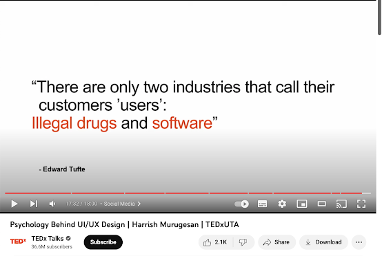
If you want to get more advanced the ted talk is the perfect next step. Every point the speaker made was new to me and lots of things stood out. The terms the speaker used will be something I will look over in the notes I took down as I listened to what he was saying. I never realised colour was so important when he mentioned that T-Mobile sued companies overusing a similar shade of magenta. Although minimalism can seem like too little work when it comes to creating a website if you go overboard there is something called Cognitive Overload. This is the stress you are putting on yourself when you are trying to learn new information. He showed us the most popular apps in grey colours and then showed us them again in colour and made us think about how we felt. He noted that our dopamine levels increased. Something that can help you when you are doing ux is thinking about the responsiveness. Us humans thrive with communication so naturally we want our websites to be more responsiveness. In the talk the speaker uses the example of liking a picture and getting a little vibration. This is called Positive Reinforcement. Making a little reward system like this will make your users want to stay on your website. The talker mentioned that when you dislike a post you do not get a reward or a nice vibration or any sort because they do not associate this with negativity. This was my favourite point out of the two sources I used because us students do not incorporate subtle things like this but after this talk, I will be looking forward to trying this out myself. The last thing that the speaker mentioned was when he used the example between the search engines Google and Yahoo. Both have the same functions, but Google is more successful because of the processing/ perception fluency- this is when easier to process content is seen is trustworthy. Google used more colours in their logo and is centred while Yahoo is too clustered, and the search bar is not the first thing you see. I learned from this point, and I feel like this is yet another point students should note when making websites. Lastly, I would like to note the quote he used at the end that you should keep in mind when creating websites: “” There are only two industries that call their customers ‘users’: Illegal drugs and software.”- Edward Tufte.” I think the app that is missing in all the sources I have looked through is TikTok. This app is unique and innovative, yet nobody is breaking down their success. Addiction and targeting the dopamine system should be the priority. When you research about UX it is evidently better to watch a video just like the ted talk source I used as it is more communicative and you will grasp a greater understanding. 


In conclusion after studying through the Forbes article and a Ted Talk YouTube video my points were that beginner developers looking to use UX should investigate the Forbes article first and then the video but researching this topic is better with videos as you absorb more of the information in. The main points that I focused on were communicating with your customers through example: surveys, testing your UX on a separate page, the terms the ted talk speaker used are helpful, how important colour is, minimalism and cognitive overload, giving your website a reward system after a positive action- this is positive reinforcement and in increase in responsiveness in your website, process/ perception fluency and how easier to look at content is seen as more trustworthy example Google. Lastly I commented on the example that most of the sources I looked for never included TikTok as an example to go through and how addiction and targeting the dopamine system are a priority. 

Monday 2 May 2022

Reading 012

My reflection on the process for developing my writing consists of me acknowledging the information I attained during any research for my topic. I feel like gathering sources with the Matrix method help me a lot and I will use it in my future assignments or/and projects for college or perhaps even my future job if I have to do as it was a good way to organise my sources. Checking the source for reliability rather than picking random sources also helped me educate myself on the topic and to enhance my chapters quality. Collectively writing a written assignment was difficult for me as even though I was in higher level English in secondary school, The curriculum never prepared us for group work. We called and organised content amongst ourselves during the beginning of the semester and as more work was given to us we talked less and less. I enjoyed the teamwork and when I was catching up I liked seeing other students work on their chapters. Seeing other peoples chapters as we worked together was useful as I could see if I did anything wrong for example I almost forgot to include the author bio. The one thing I didn't enjoy was writing as I don't like reading.

Wednesday 13 April 2022

Reading 05


After watching the video that educated me on the method of coding a document and creating themes in Matrix table however I find the questions given to me for this book to be of better use to me. During the previous weeks I have not found any use in this table as I find it time consuming to make. Time is of the essence for me and not doing work during the time of my illness set me back with my progress. This is a brilliant way for organisation and I may find it useful for future work as themes help you remember information within your evaluation section in your writing pieces. I go to my sources and highlight sentences I could possibly use for my chapter and research more into it afterwards. I personally find this easier as I know I will not worry about the matrix table and I will most likely not miss any points as I like to read over them more once.